I get a little bit obsessive with my stats on blogger and photobucket. Anything that has a pretty graph that tell me how many people are interested in what I'm doing.
74 people yesterday ! whoa ! didn't expect that...
I'm not sure why I got so much traffic all at one time (16:00 is 4:00 pm i believe) but i guess its a little motivation to do some more posts.
That's my other blog...I dont want to bomb the people in my class with too many posts when they look for work.(Y)
Wednesday, October 20, 2010
Tuesday, October 12, 2010
EMPHASIS - Part 2 - How is is used
There are many different ways to emphasize the "focal point"
Change the colour of what you want to emphasize:

This is a good representation of using colour to create a focus point. The model's skin and the background don't compete with the neon pink lips which is why it the first thing the viewer looks at. This technique is good because it is simple and direct.

Yes these "art" principles and elements do apply to typography.
Without the colour you might have read shoulder x4
SHOULDER
SHOULDER
SHOULDER
SHOULDER
^ thought it was kinda cute.


Use framing to draw attention to your subject.


J'ADORE. J'ADORE. J'ADORE.
This photo both FRAMES the model and uses the makeup tools as LINES to draw attention to her face and EMPHASIZE her makeup. (did i really just put all those important words in one sentence >? YEESS !)
which brings me to the next point...
Use of lines - to both create more interest and create "focal point" !!!


Lines do not have to be literal. The rocks on either side of the model serve as lines to both FRAME and draw the readers attention.
Play with PROPORTION


at least for this picture... KANYE IS THE MAIN SPOTLIGHT. sorry taylor swift :P

PLAY WITH SHADOWS...

Nothing is made more important than THE HAIR in this picture...although, I could do with out the visible jeans though...but thats for another day...MOVING ON !
I have no doubt in my mind that there are probably better examples or more points... but thats for you to figure out - not my issue.
THE MAIN THING IS REMEMBER ABOUT EMPHASIS IS:
BE DIFFERENT AND STAND OUT
BE BIG & BE BOLD
GO HARD OR GO HOME!!!
Wednesday, October 6, 2010
VARIETY
Variety is a principle of art.
def. the differences in the elements of a compostition.
- visually CHAOTIC - can be interesting

This is the definition of variety. It is visually chaotic. There is not one focal point or patter or repetition. It is a bunch of visuals combined together to create a busy piece of artwork.

i found this photo sideways and im going to leave it sideways. if only i could do this...
is it really necessary to explain how this is variety ? LOVE IT !
BALANCE
Balance is a principle of art.
Symmetrical - perfect visual image or equal visual weight (ex. apple + orange)
- elements are equally weighted or distributed on either side of a central vertical axis.
- "mirror image"
Asymmetrical - unequal arrangement -creates feeling of tension or imbalance
- attracts and holds your attention

This photo is a great example of symmetry. The face is perfectly framed by the hair and the make up and facial expression are very neutral which doesn't take away from the "focal point" the hair.

I'm in love with this photo. The feeling evokes an edge and playfulness. The 3 blondes have similar hairstyles and dark clothing but the far left model attracts the viewers attention for unbalancing the photo. She is a fresh breath of air and reminds me of someone who would have "a secret"
EMPHASIS - part 1 - what is it ?
Emphasis is an principle of art.
def. the focus an element (or group of elements) make to stand out.
"Dominant" or "Focal Point"
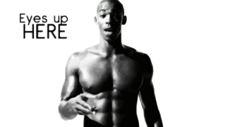
Emphasis does exactly what the above picture says...its like constuction signs for EYES UP HERE. Please note: this picture is ironic because the main focus is NOT the eyes. LOL
Emphasis does exactly what the above picture says...its like constuction signs for EYES UP HERE. Please note: this picture is ironic because the main focus is NOT the eyes. LOL
PROPORTION

def. the size relationships between parts of an artwork to an another.
- Used to shw emphasis, distance in space, and balance.
Note: by itself it has little meaning. Only when compared to the size of another object can we understand its size.

This photo is amazing because the beads in the picture are so much larger compared to the model than in actual life. It makes the normal sized model look "doll like". Without the beads, this picture could look bland, instead it adds to the story of the picture. It has a whimsical feel.
MORE INSPIRATIONS:


RHYTHM
Rhythm is a principle of art.
def. the repetition, alternation or progression of elements
- gradual - in size, shape, position, or colour.
- creates movement

This picture is a good representation of rhythm because it the combination of colour, line, and pattern create a dizzing movement for the viewer.
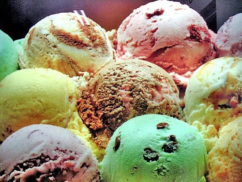
The gradual changes in shape and size are best seen in the picture below. Although, it could have been a clutter of random items, the positioning and stacking of similar items of different sizes add to the overal look of the picture and atmosphere.
The gradual changes in shape and size are best seen in the picture below. Although, it could have been a clutter of random items, the positioning and stacking of similar items of different sizes add to the overal look of the picture and atmosphere.

► ALL BLACK EVERYTHING ♫
HARMONY
Harmony is a principle of art.
def. combination of similar elements in artwork to communicate ONE idea or feeling. The objects in the artwork must have a sense of unity.
OR
The use of the elements and principles to create a sense of wholeness to a piece.

I chose this photo because I liked that model, blogger Tavi, seemly blends into the background although her skin is extremely pale and her shirt does not match or her background exactly. However, her shirt is in the same colour palette as the trees behind her which allows the eyes to blend her into the background. I though this photo was interesting because it leaves me wondering, did this photo happen by chance ? NOT !! or did she delibrately buy the shirt the colour of her surroundings to get this shot.
MORE INSPIRATIONS:


SHADE
Shade is an element of art.
def. the contrast between light and dark values within an image for creative effect or emphasis.
- Needed to express volume or a sense of three-dimensionality.
- Can often indicate a light source in an image.

I chose this first photo because the extreme lighting and play of shadows create a lot of intrest and mystery, which add to the story of the editorial. The main lighting is probably coming from an angle beneath the the model, which is strangely unusual. Also, the dark shadows hide the models face and cover her in weird areas, like half her hand, which creates dimension and added interest - playing into her character.

I chose this photo because while it also has extreme lighting, it is used in complete contrast. There are virtually no shadows on the model which brighten up the clothes and the choice of colour - red - is the focal point. The lack of shadows is more inviting and commercial friendly as the model has nothing to hide. This is a good advertising strategy as it attracts more buyers and highlights all of the clothes to be sold.
SPACE
Space is an element of art.
def. The areas around, between or within shapes. Space can be positive or negative. Space can show depth or give the appearance of objects being three dimensional in artwork by using perspective techniques.
- Positive Space- the actual objects or shapes in artwork
- Negative Space - the space around and between objects in artwork


An easy way to spot space is to look at the horizon level. The horizon level can distribute the positive and negative space evenly or it there can be more positive space than negative space and vice verca.

I love this picture because it was taken by an average blogger so what the photographer did to the horizon was probably by accident. Most horizon levels are level and help to balance the picture. In this picture the horizon level is higher than normal and is tilted. This dramatically changes the outlook of the picture because the girl's dress has bold black lines that represent stillness and security. The offbalance of the dress and horizon level make the viewer feel like something is missing and slightly off balance but it's the combination that works together.
MORE INSPIRATION (using horizons):


Normally centering the subject of your photo tends to be boring and "average". Most people with a camera are never educated on rule of thirds (a compositional technique that makes photos more interesting and dynamic) which is why they always center their friends or object. This photo is amazing because the centering the model looks regal or of a higher class in the theatre box. Also, the framing another compositional technique helps to center the model; the main attraction.

^ more framing.


Subscribe to:
Comments (Atom)